
User-friendly Tools for Science
by Hylix Insights
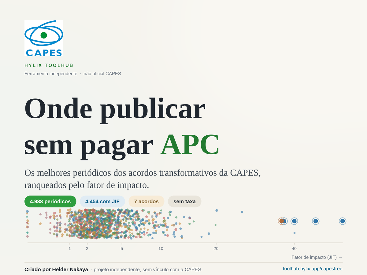
Busque entre 4.988 periódicos dos acordos transformativos da CAPES onde autores de instituições participantes podem publicar em acesso aberto sem pagar a taxa de processamento (APC). Filtre por nome, área ou editora e veja tudo ranqueado pelo fator de impacto (JIF), com uma visualização animada por área. Ferramenta independente criada por Helder Nakaya — não é um site oficial da CAPES.
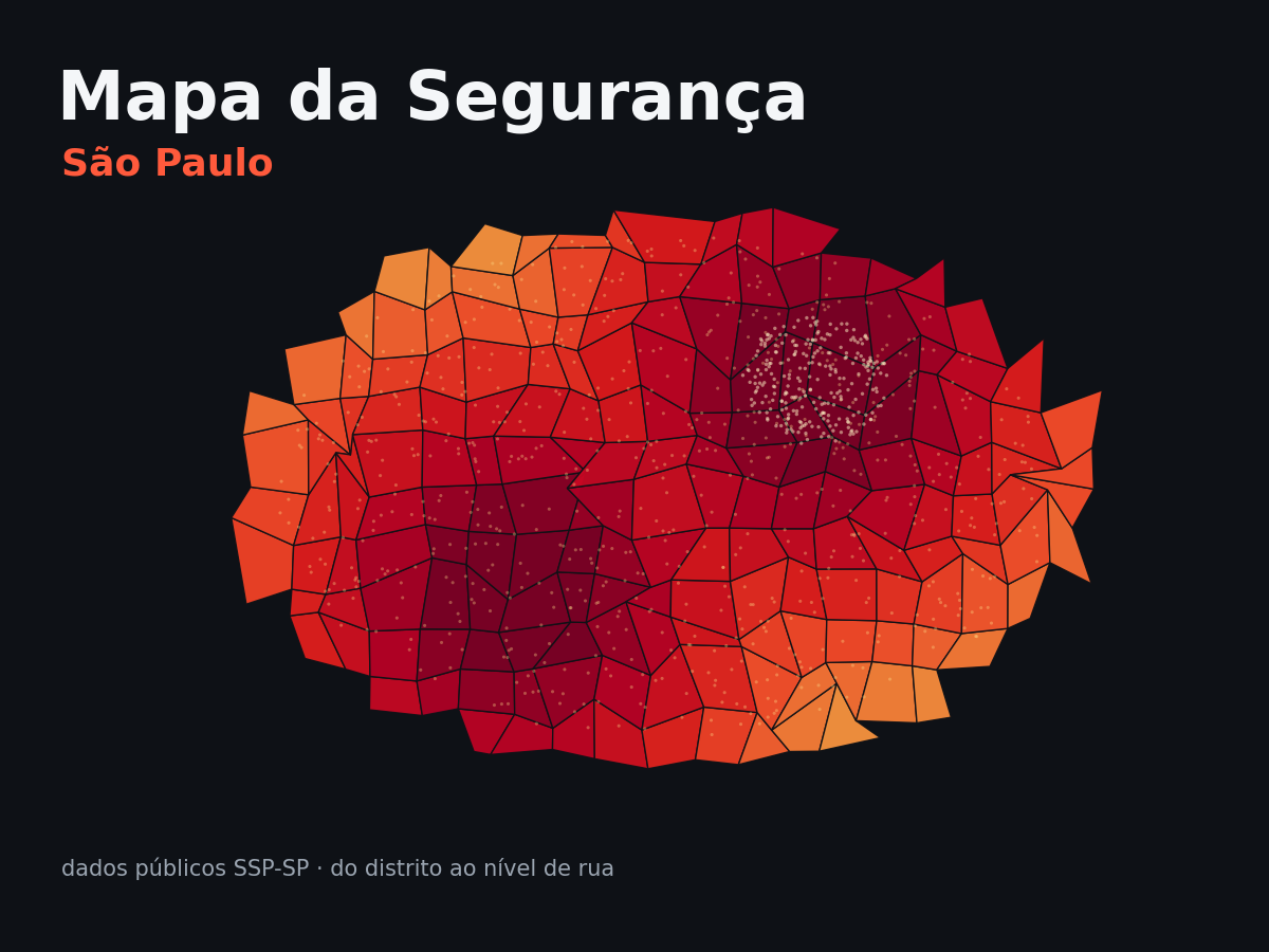
An interactive atlas of public-safety data for the city of São Paulo, compiling official SSP-SP records at two scales: a choropleth overview by district and subprefecture, and the exact street-level location of each incident. Includes crossfilter panels, time series, hourly patterns and a dedicated view on violence against women. Built by Marcos Lemes Toquetão.
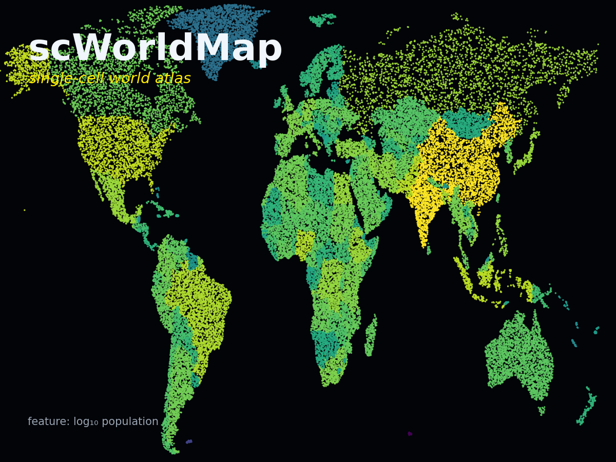
An interactive world map reimagined as a single-cell atlas. Search countries and explore population and World Cup titles as feature plots, where each nation is rendered like a cluster of cells — all client-side, with full data privacy.

A guided checklist to surface what you don't know before, during, and after building with an LLM. Copy ready-made prompts, capture the answers, and export a project brief — all client-side.
Visualizes academic production and supervision history from Brazilian Lattes CVs, including publications over time, journals, talks, committees, and completed advisorships.
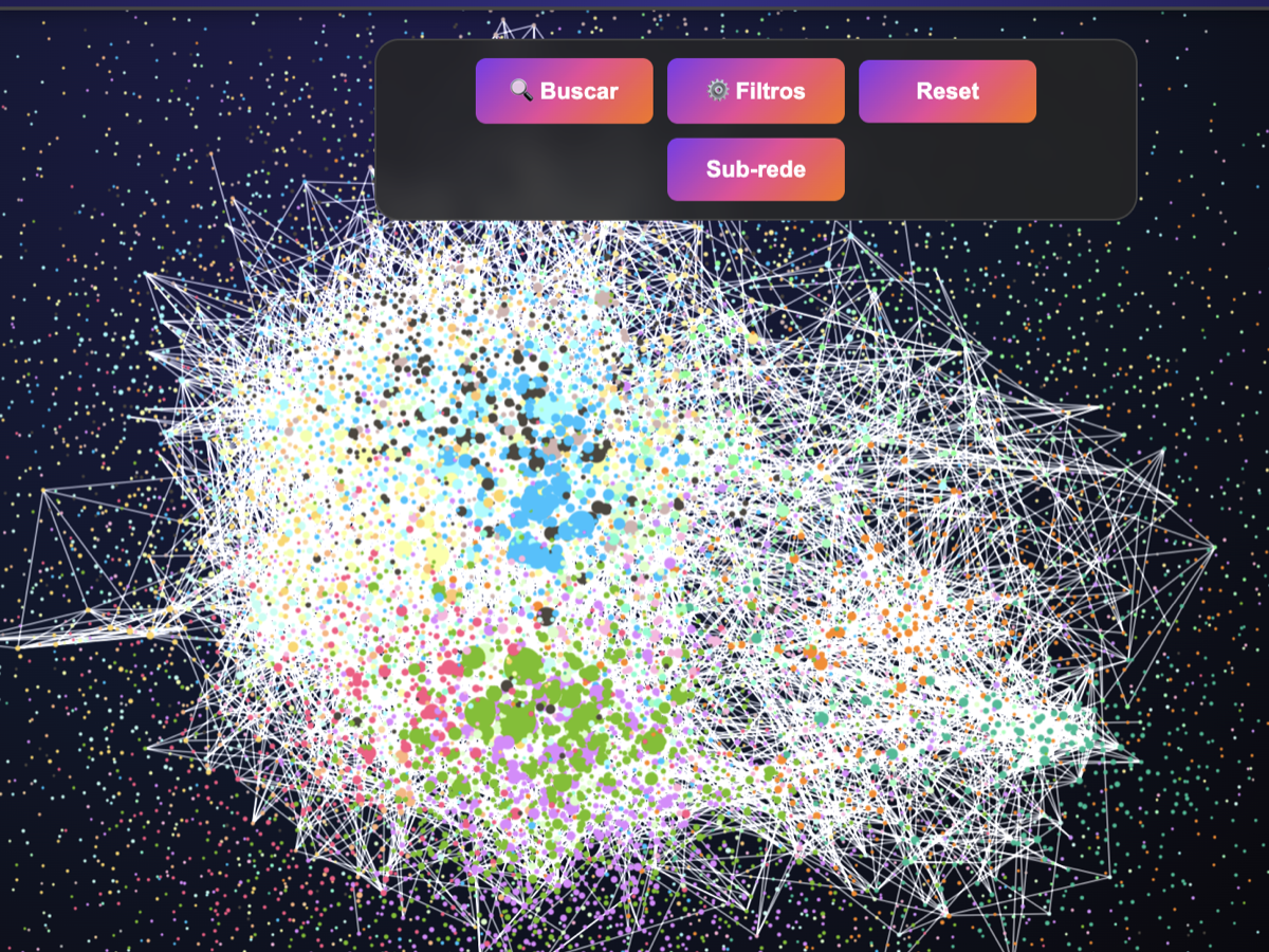
Discover and analyze co-authorship networks among Brazilian immunologists. Identify collaborators, visualize research communities, and explore connections between authors based on shared publications.

Generates bar race visualizations based on scientific publications, allowing users to track which diseases receive the most attention in each country and how this focus evolves over time.
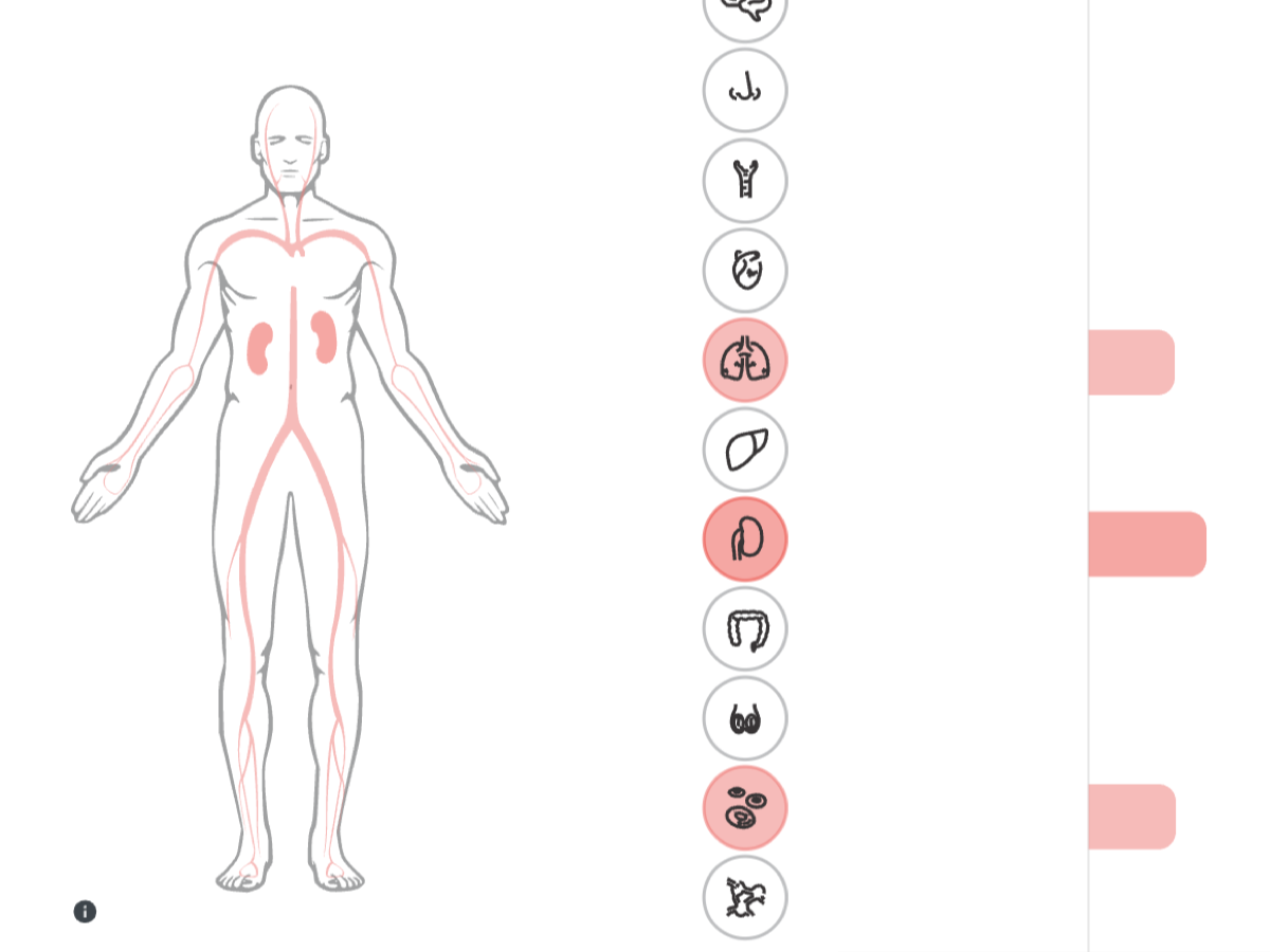
Interactive platform for exploring transcriptomic and immunological datasets related to severe COVID-19. Enables researchers to browse genes, networks, and co-expression modules altered across different organs.
Robust correlation and linear modeling resistant to outliers. Implements the RANSAC algorithm to estimate relationships between variables without distortion from extreme samples or measurement errors.
Quantifies the molecular degree of perturbation in transcriptomic datasets. Upload gene expression data and estimate how strongly each sample deviates from a reference state, enabling rapid detection of disease-associated molecular changes and sample heterogeneity.
Automated discovery and analysis of gene co-expression modules. Identifies transcriptional modules, performs enrichment analysis, integrates interactome information, and produces interactive reports for interpreting biological pathways.
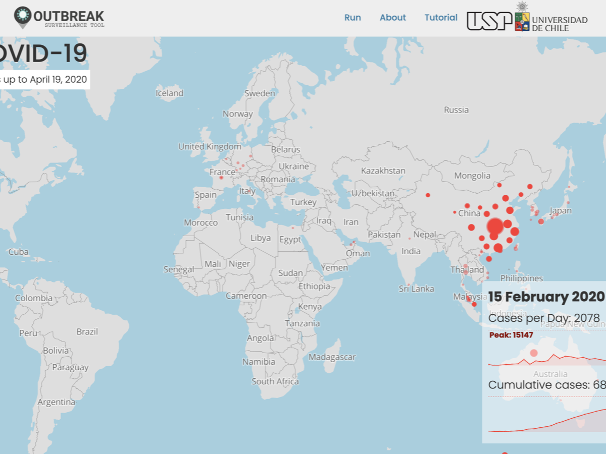
Interactive visualization of spatiotemporal events on a world map. Upload latitude, longitude and date to animate how events spread or evolve over time.
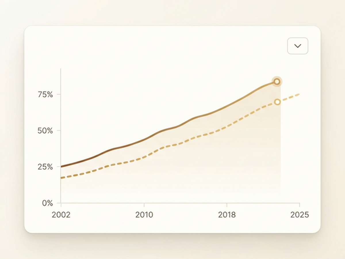
Track the evolution of female first and last authorship across top scientific journals from 2002 to 2025. Animated line charts reveal gender trends in academic publishing, powered by live data from Google Sheets.
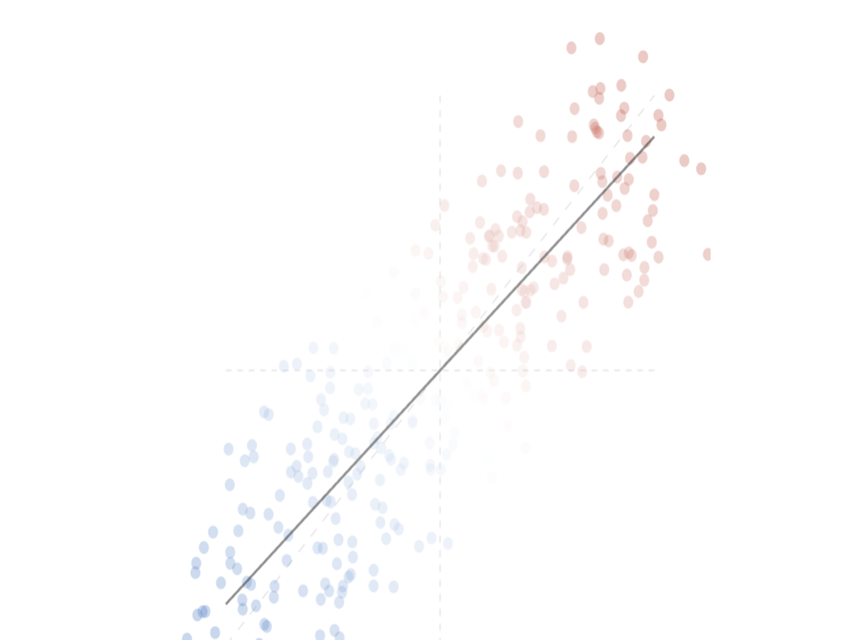
Visually compare two differential expression signatures side by side. OmicLine generates an interactive scatter plot with regression line to reveal concordance and discordance across omics experiments — entirely client-side, with full data privacy.
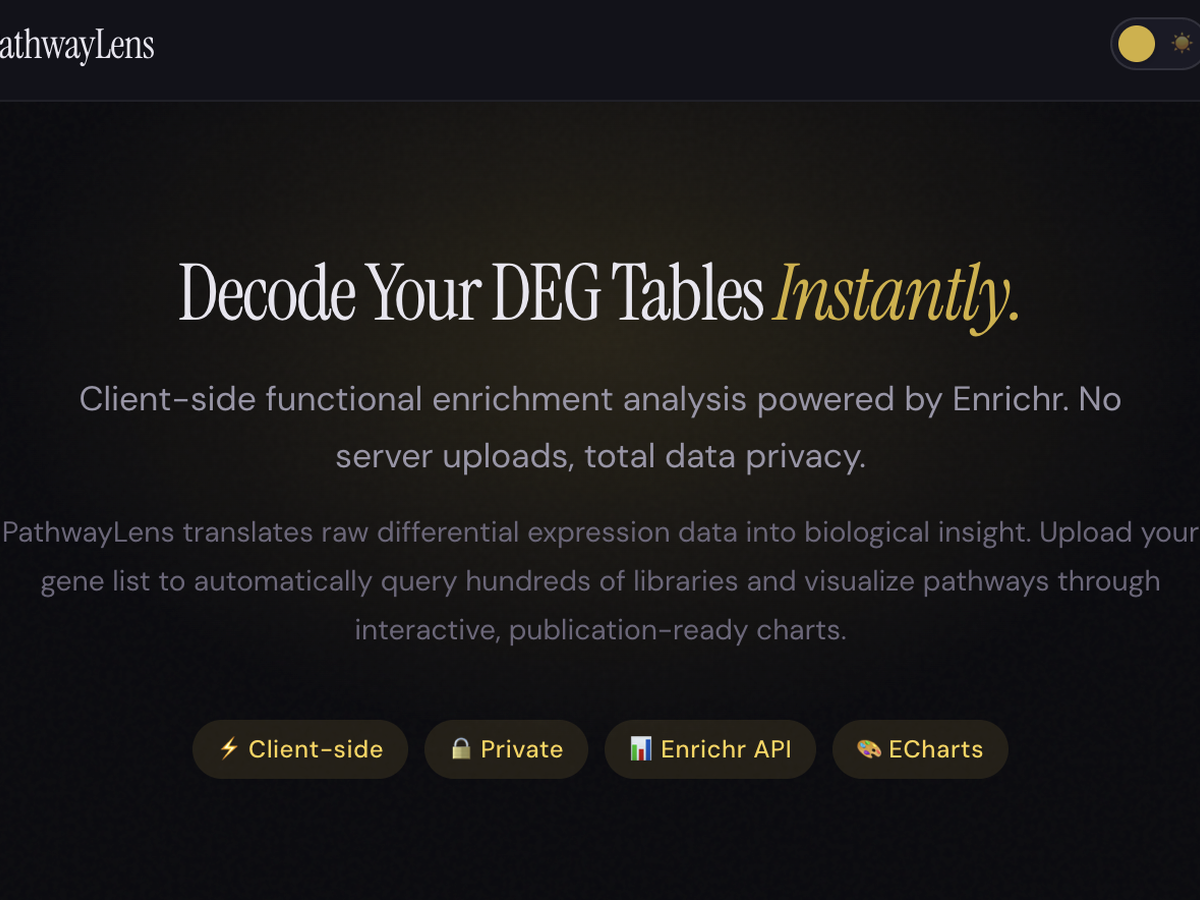
Decode your DEG tables instantly. PathwayLens translates raw differential expression data into biological insight by querying hundreds of Enrichr libraries and visualizing enriched pathways through interactive, publication-ready charts — all client-side, with total data privacy.
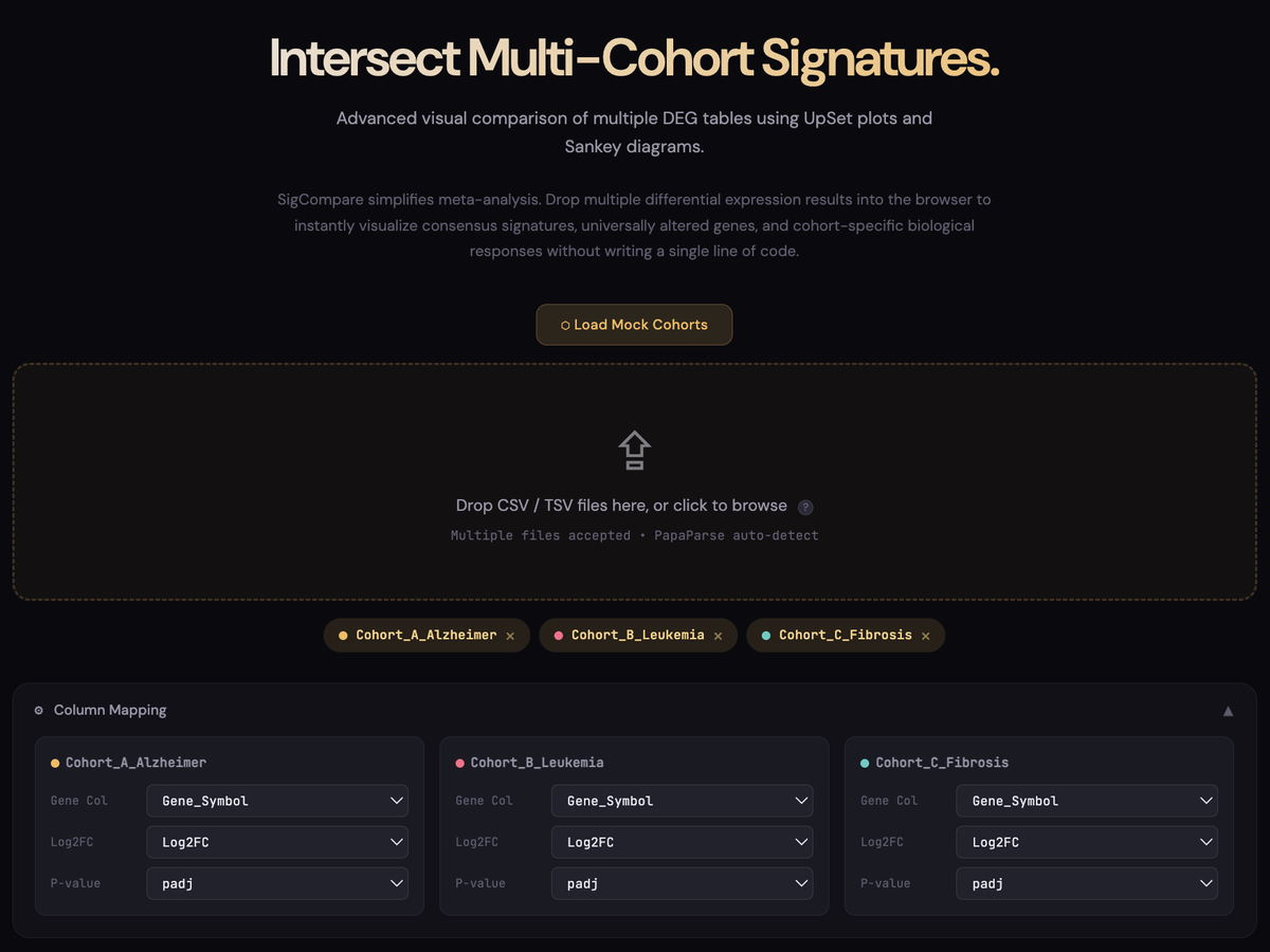
A simple, code-free way to compare gene signatures across multiple cohorts. SigCompare allows you to instantly intersect differential expression results (including those generated directly from GEO2R) to visualize consensus signatures and unique biological responses through direction-aware UpSet plots and Sankey diagrams.
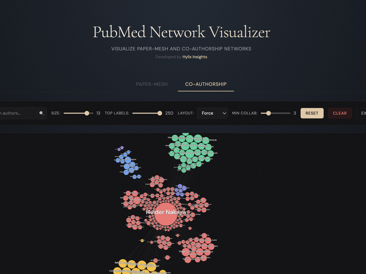
Visualize PubMed medical literature in an interactive network graph. Discover connections between authors, topics, and publications intuitively.
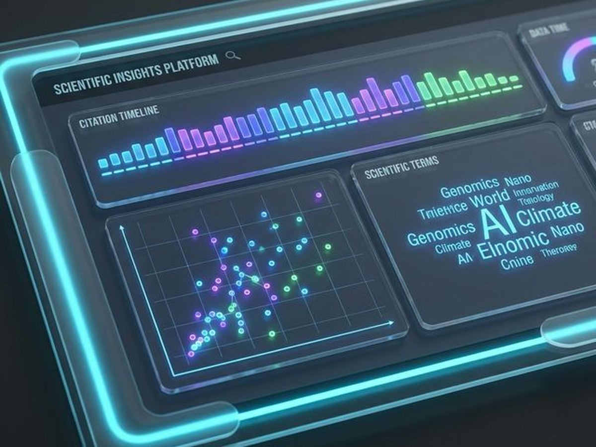
Dive deep into scientific impact. Visualize citation timelines, top publication venues, and research focus through interactive dashboards powered by Semantic Scholar data.

An interactive demonstration of handwritten digit recognition using an embedded Convolutional Neural Network (CNN). Draw directly in the browser and witness 100% client-side AI inference occurring in real-time.
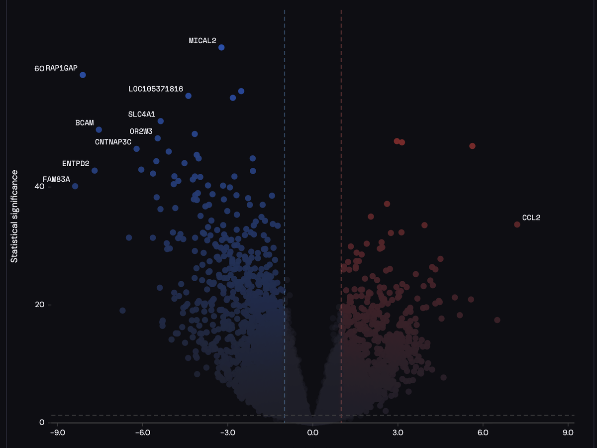
A clean client-side volcano plot for differential omics signatures. PyraPlot visualizes effect size and statistical strength using dual diagonal gradients and transparency encoding. All computation runs locally.
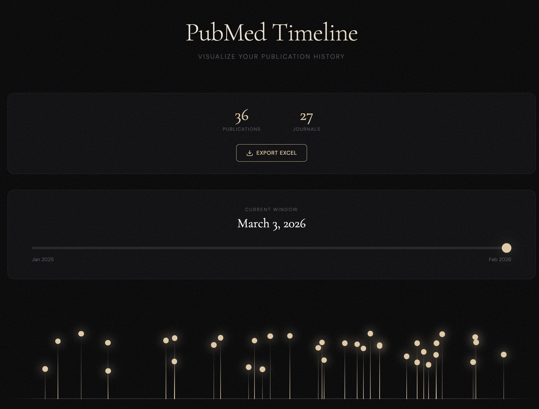
Interactive visualization of scientific publication history. Analyze journals, publication dates, and research impact over time using standard PubMed export files.

Real-time 3D particle visualization driven by facial expressions and hand gestures. Explore emotional states and interactive particle systems.
No tools match your search or filters.